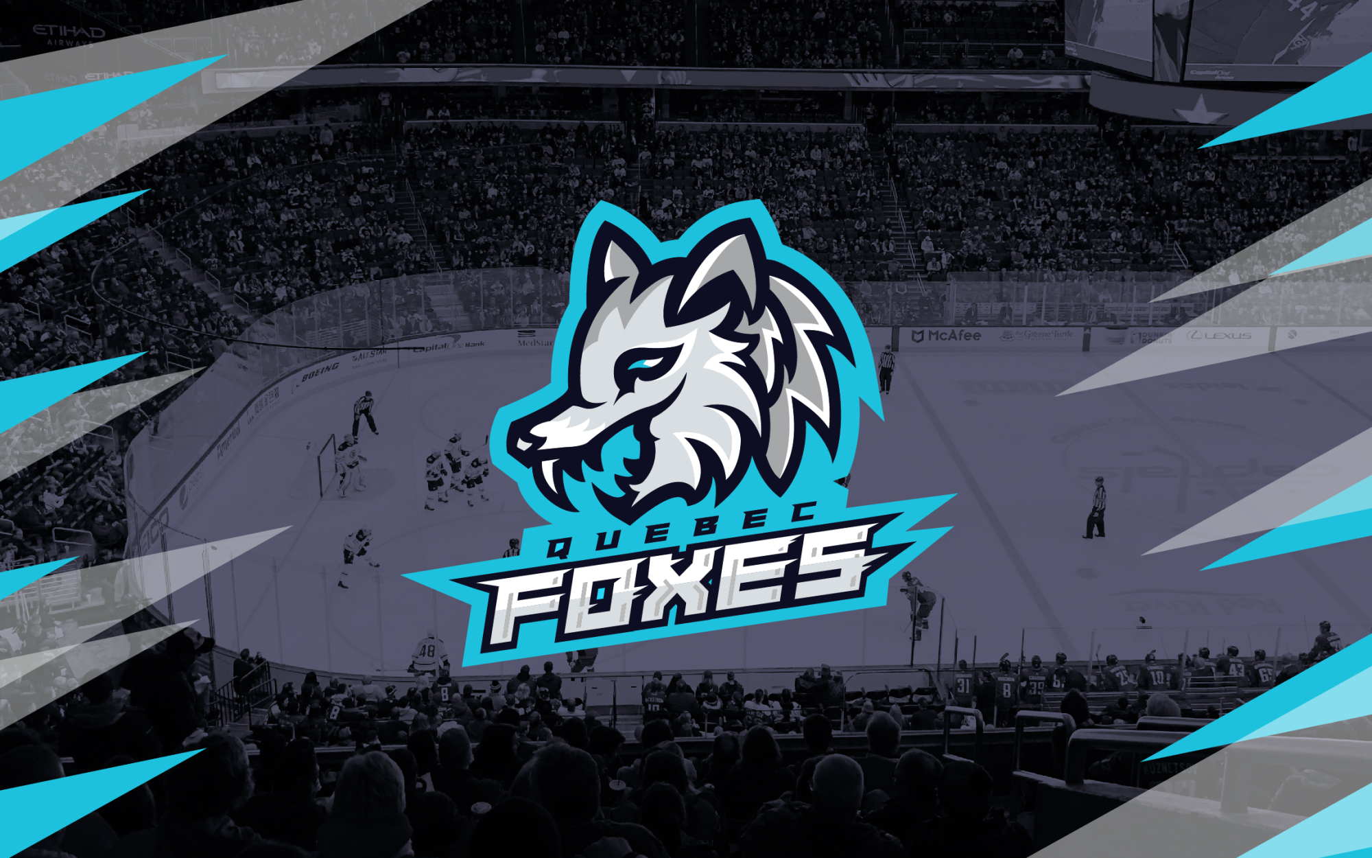
Quebec Foxes
Quebec Foxes
Quebec Foxes
Quebec Foxes
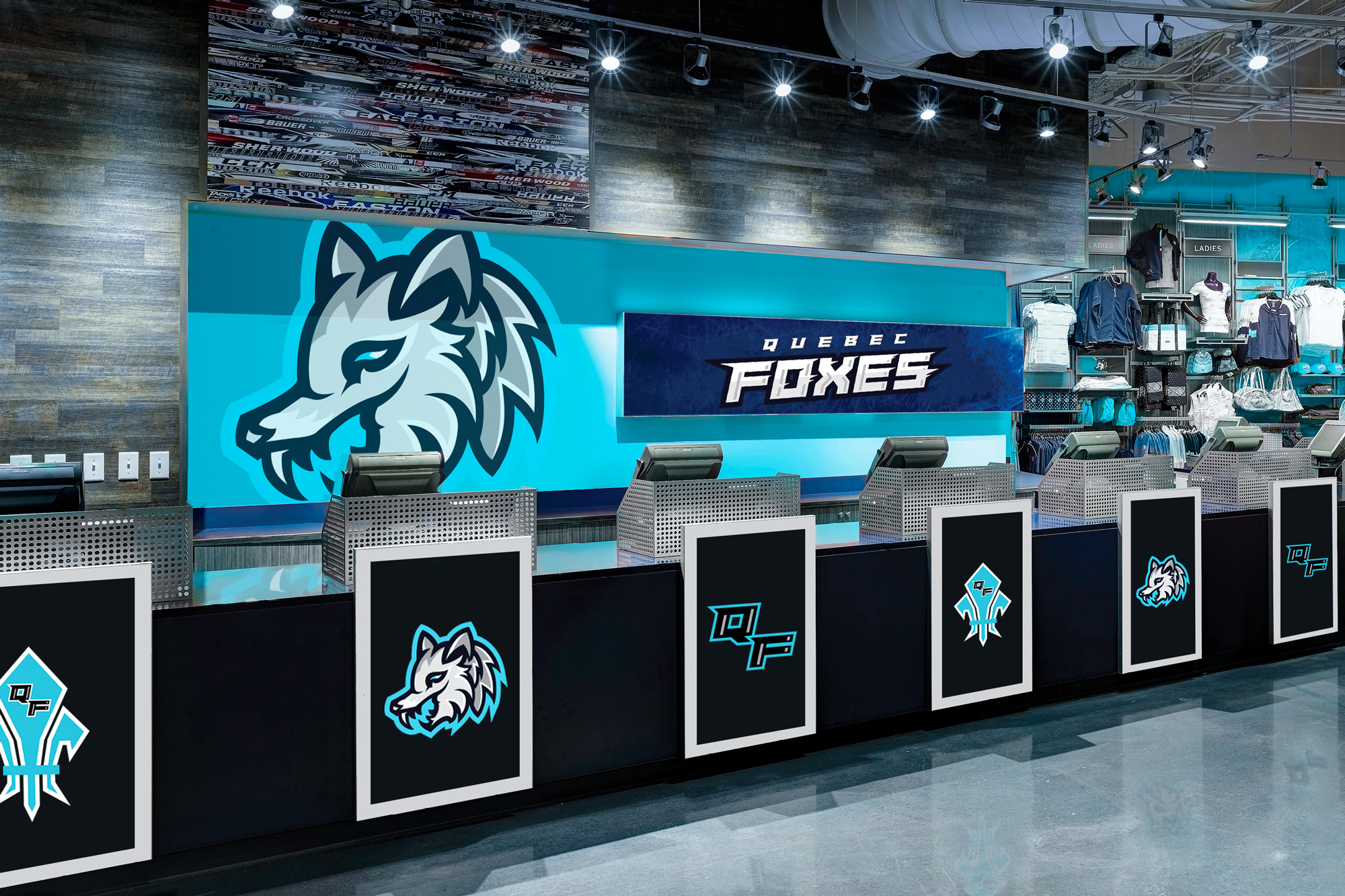
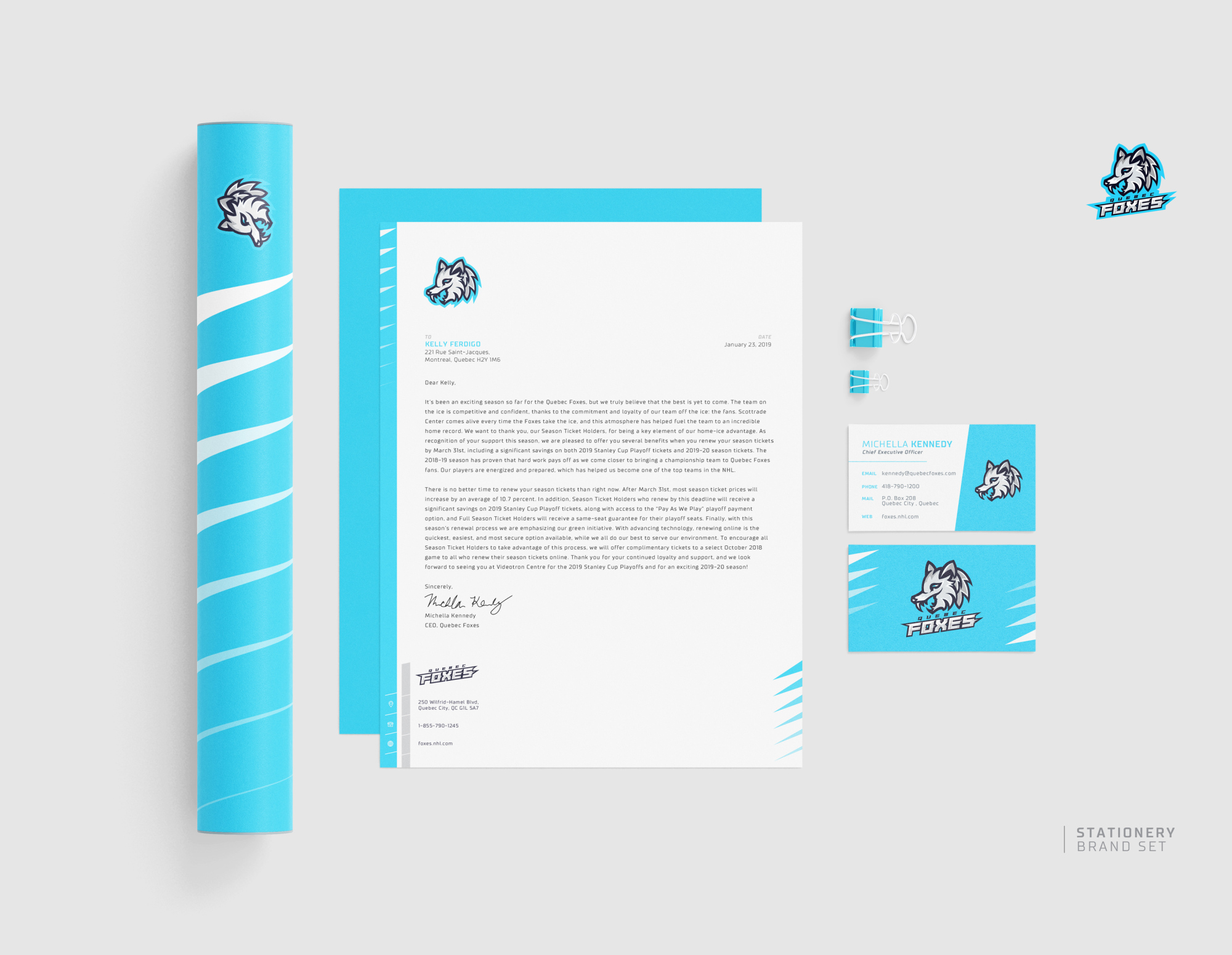
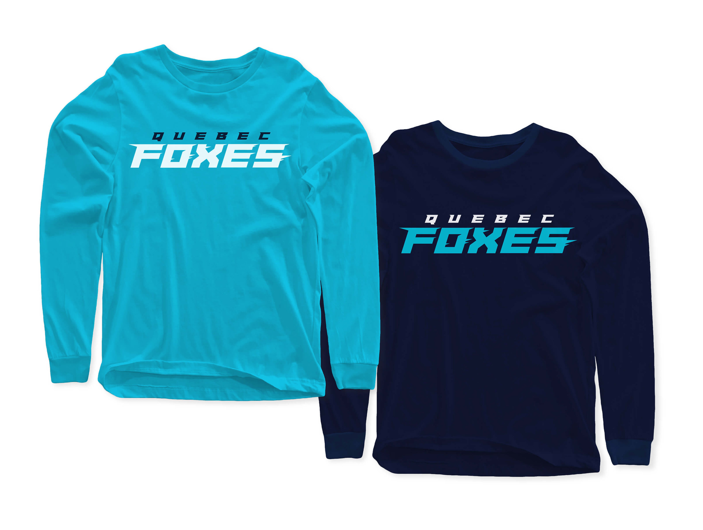
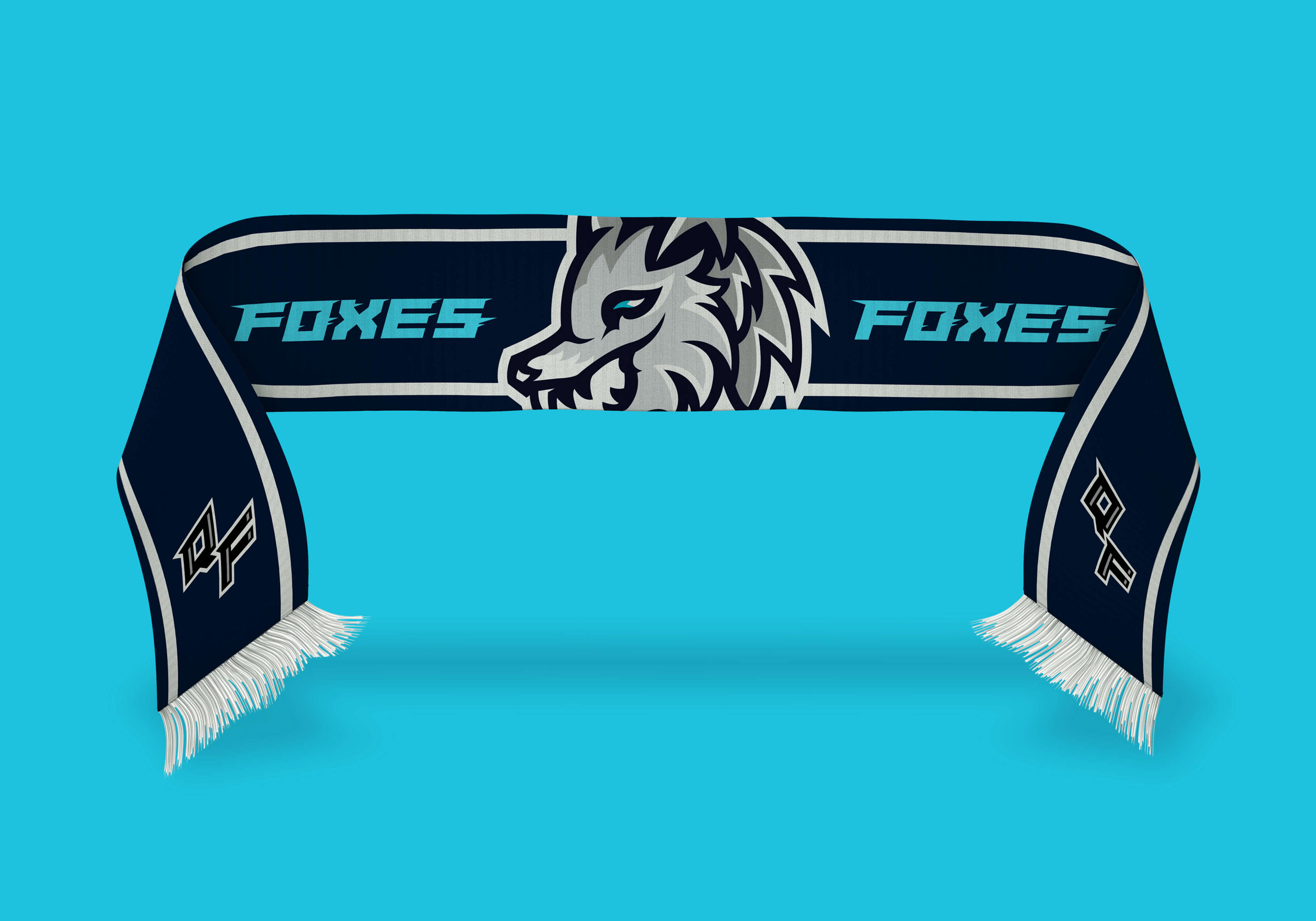
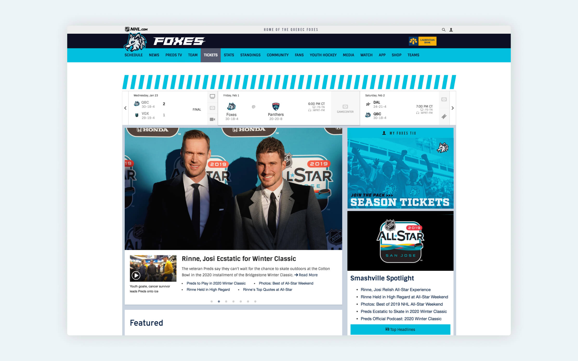
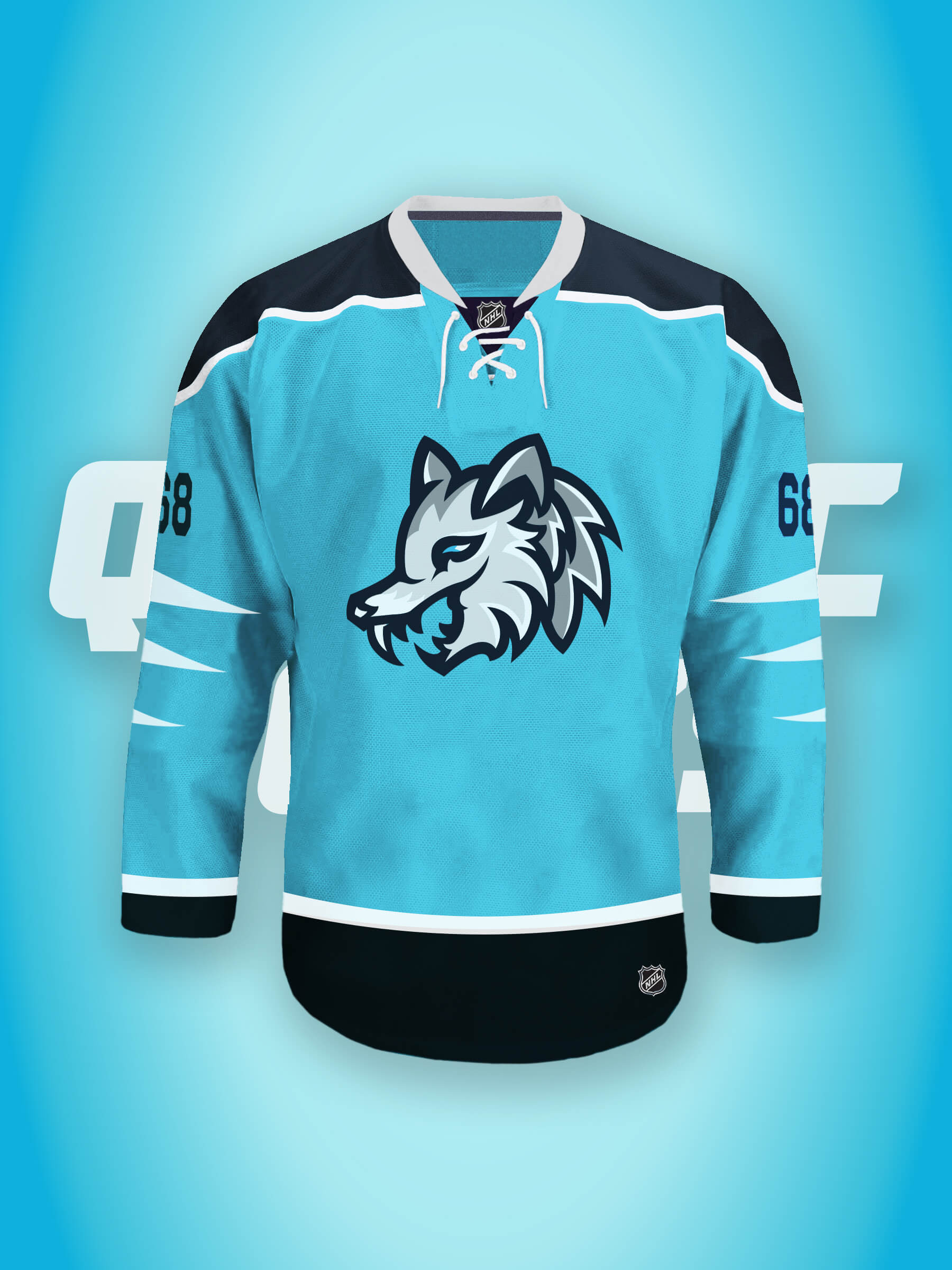
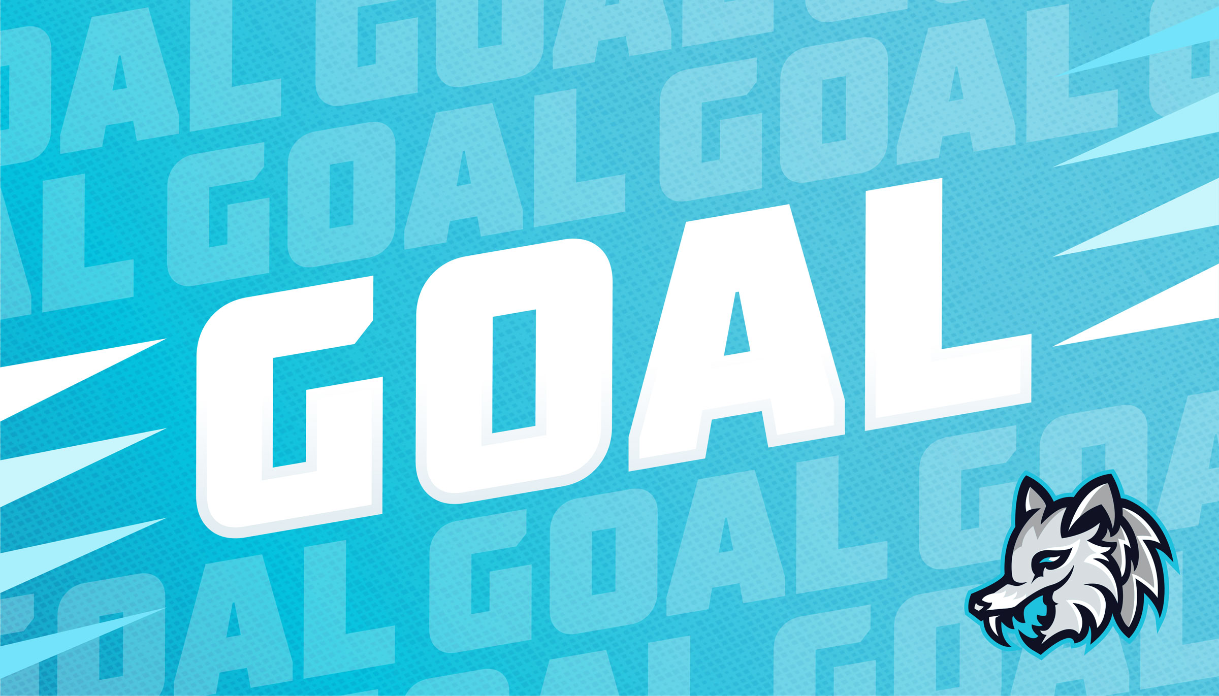
The next NHL fictional hockey team sought a brand to establish a strong visual identity and online presence. The project aimed to create a modern, athletic brand that would resonate with local fans and showcase its Quebecois identity amongst other great hockey teams.
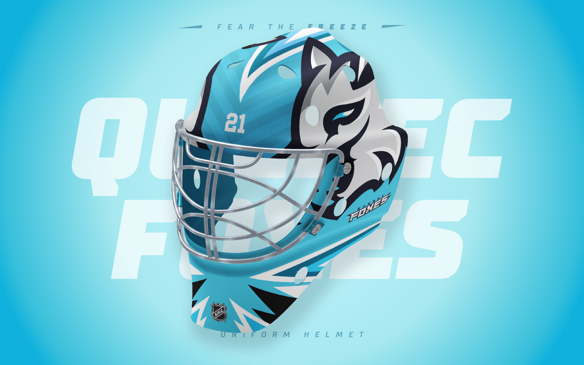
The white fox holds cultural significance in Quebec, as it is a native species to the region and is often associated with the province's wilderness and natural beauty, symbolizing speed and agility. The use of a white, teal, and black palette alluded to the colder regions of the state, alongside a custom type treatment that is uniquely sharp and assertive.
Client
Quebec Foxes
Project Team
Creative Direction: Sebastian Arredondo


Say Hello! 👋
Say Hello! 👋
Say Hello! 👋
sebastianthecreative@gmail.com
Say Hello! 👋
sebastianthecreative@gmail.com
Say Hello! 👋
-
-
🏰 ➡ Orlando
🎸 ➡ Nashville
🚀 ➡ Houston
🌎 ➡ Earth
🏰 ➡ Orlando
🎸 ➡ Nashville
🚀 ➡ Houston
🌎 ➡ Worldwide
🏰 ➡ Orlando
🎸 ➡ Nashville
🚀 ➡ Houston
🌎 ➡ Earth
©2024 Sebastian Arredondo. All Rights Reserved.
©2024 Sebastian Arredondo. All Rights Reserved.
© 2024 Sebastian Arredondo.
All Rights Reserved.